Why Do People Prefer My Old Blog's Layout To Substack's?
Scott Alexander explores why readers prefer his old amateur blog layout to Substack's professional design, presenting survey data and considering various explanations for this unexpected preference.
This keeps coming up. When I was first considering moving to Substack, I asked my readers what they thought. They thought various things, but one of them was they hated the layout. At some point I turned this into a formal survey, and:
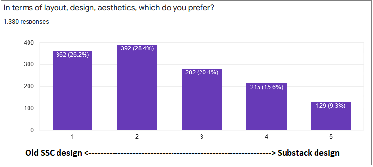
…yep, they preferred the SSC layout
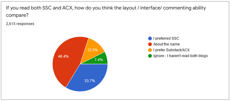
Last summer, I repeated the experiment, this time after I had made the switch:
A few months ago, I wrote a post called Why Do I Suck, which discussed some people’s complaints about the new blog. In the comments, lots of people said their main complaint was that Substack’s design was worse than SSC’s. EG:
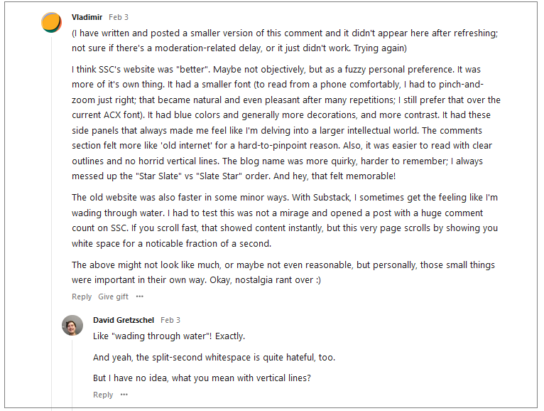
I think that all of this together is pretty strong evidence that most people prefer the old Slate Star Codex layout to the new Substack-mandated ACX.
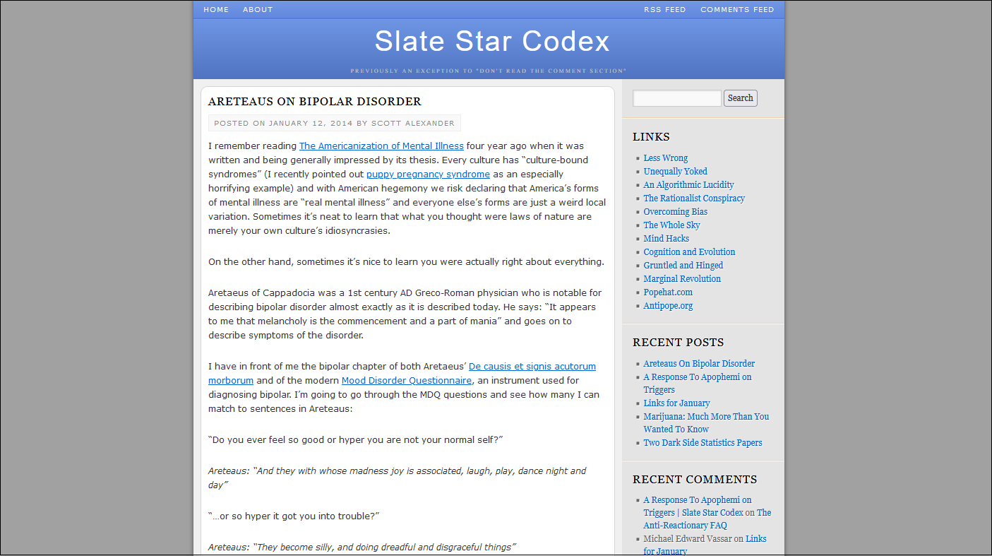
This is weird, because the old Slate Star Codex layout was - mostly something I threw together in a day or two. I am widely recognized as not having taste, and the only website I ever developed before this was a Geocities site that was even worse. A few of my web designer friends helpfully smoothed over some rough edges (in one case literally, Apple-style), but the basic design remained my amateurish rush job.
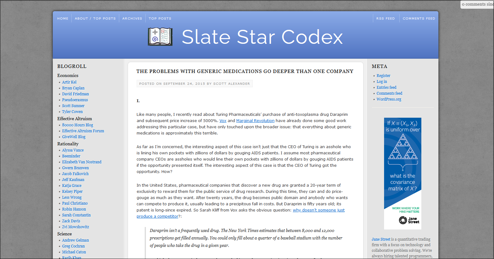
Meanwhile, Substack is run by tech industry veterans who probably hired a team of really experienced designers and thought really hard about every aspect of their product. It doesn’t make any sense at all for me to do a better job than them. So what’s going on?
Is it selection bias? My previous readership is, by definition, people who liked my old blog, so of course they like my old blog more than some new one? I’m including this because I know someone will bring it up in the comments if I don’t, but it seems unlikely; surely most people selected themselves in for the content, with the design a distant second.
Is it something something mobile? I put no effort into optimizing my old design for mobile phones, so maybe that adds another layer of complexity. But I think at some point some web designer friend made a version that worked for mobile, so this can’t be too hard.
Is the dichotomy not me vs. Substack, but WordPress (also a great tech company) vs. Substack? I think this explains some of it. But some of the people in the comments talked about the colors and layout in particular.
Substack probably remembers the history of MySpace vs. Facebook. MySpace let people customize their page however they wanted, and most people made them into some sort of <blink>-tag-related monstrosity. Facebook gave everyone a consistent minimalist design that let people focus on the content, and took over the world. I’m not (exactly) questioning Substack’s decision not to make blog layout very customizable. But how come their standard non-customizable layout is (apparently) worse than my old layout? If they forced everyone into the standard non-customizable layout of 2015 SSC, would that be a straight utility gain?
This may be a little too cute, but I can’t help but think of Whither Tartaria? In every art form, complicated colorful designs transition to “modern” minimalist designs over time. Whenever anyone asks, people say they hate the modern minimalist designs and wish they could go back to the complicated colorful ones. But for some reason nobody ever does. Is this just the Internet version of the same general phenomenon?