Beware Regional Scatterplots
[Epistemic status: Not original, but worth mentioning]
I’ve been using scatterplots of different states and countries a lot here lately. For example, this one in the discussion about guns:
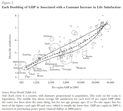
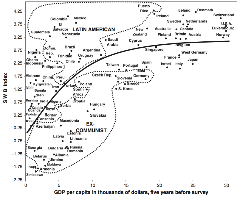
 And this one in the discussion about national happiness:
 Hopefully we already know that we should worry about confounders like income and race and those kinds of things when we’re looking at a graph like this. But recently I learned it’s even worse than that. Consider for example this:
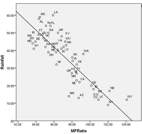 This is the average yearly rainfall in the lower 48 US states vs. their gender balance (measured in number of men per 100 women). The correlation is about r = 0.84 (p ≤ 0.0001), much higher than anyone’s ever found between guns and crime, or income and happiness, or most other things people make regional scatterplots about. So what’s going on? Do women cause rainfall? Does rain drive men away? Or is there some confounder that causes both rain and womanhood?
I don’t think it’s any of these things. I think it’s a coincidence.
“But you said p ≤ 0.0001! There are forty-eight data points and the fit is almost perfect! How could it be a coincidence?”
But I don’t think there are forty-eight data points. I think there are three data points. For 48 data points to all lie the same line is very impressive. For three data points to all lie on the same line is much less so.
I think that Southern states have more women (probably because they have a higher male incarceration rate, and incarcerated men aren’t counted) and more rainfall. Mountainous western states have more men (probably because the jobs there tend to be in manly mining/forestry type industries) and are pretty dry. And other states are somewhere between those two extremes.
Within these regional categories the rainfall/gender relationship is random – on the scatterplot it would look like a circle. But between these three regional categories the rainfall/gender relationship is very strong, making the whole chart consist of three circles in a line. Crucially, because these are kind of amorphous circles and they blend into each other, you can’t tell that that’s what’s going on. Here’s my graphic depiction of this:
 In the first box, the gray points show what looks like a very significant correlation – the further right you go on the horizontal axis, the further down you go on the vertical axis. The gray trend line confirms the strong relationship. In our US state example, this was a correlation between many women and high rainfall.
In the second box, the gray points are revealed to be grouped into three regions: blue, green, and red. In our US state example, blue is the female-skewed and rainy Southern states, red is the male-skewed and dry Western states, and green are all the other states with pretty average rainfalls and gender balances. Within each region, there’s no relationship between rainfall and gender, as shown by the horizontal red, green, and blue trend lines.
In the third box, we see what I’d argue is the correct interpretation of the data. There are three big data points – the South, the West, and the Rest – and they do sort of form a line but nobody cares about a line between three data points.
If I go back to my statistics packet and repeat the rainfall/gender correlation with only three points – the Southern average, the Western average, and the Other average – I still get r = -0.84, but now p = 0.3. The statistics have no reason to think it’s anything other than pure coincidence – and indeed, with that small a sample size, why would they?
I think most real studies are smart enough to control for this – although it’s really hard to determine how exactly you should be doing that and leaves a lot of wiggle room for people who want to fudge their way to a preferred result. But basic scatterplots do not control for it, and so almost every regional scatterplot is suspect.
This is why I was happy to see the income/happiness correlation broken down further:
 This makes it clear that the income/happiness relationship is primarily cluster-driven, with clusters of ex-Communist countries, Latin American countries, and Euro/Anglosphere countries (if you’re willing to do some more work, you can sort of make out clusters of African and Asian countries). None of these clusters show a strong income/happiness relationship except for the ex-Communist one, which suggests this might be the same kind of confounding as the rainfall/gender example above.
…unless I’m biased and reading too much into this. It’s really easy to change your conclusion just by changing your clusters. For example, if Puerto Rico counts as Latin American, then that creates a pretty impressive happiness/income relationship within that cluster. If it counts as Euro/Anglosphere – it’s part of the US, after all – then there is no income/happiness relationship within either cluster. So which is it?
Or what about this? I claim that the apparent income/happiness relationship within the ex-Communist countries is actually an artifact of Europeanness. The richest ex-Communist countries, like East Germany and the Czech Republic – are also the happiest only because they are closest to Western Europe, which is both happier and richer than the rest of the world. Likewise, the poorest ex-Communist countries, like Armenia and Georgia, are also the unhappiest only because they are the furthest and least Western European of the bunch.
Once we start going there, we can pretty much prove or disprove anything we want based on our own intuitions about how to group things. I am suspicious of this, but I’m also equally suspicious of not doing that – do you really just want to let it pass that Puerto Rico, the closest Latin American country to the Euro/Anglosphere cluster, is also politically Euro/Anglosphere?
Overall there is no good answer and I would recommend against drawing any strong causal conclusions from a scatterplot unless someone has very carefully addressed these concern.
EDIT: Inty gives a great (ie horrifying) example in the comments, and Theo Jones discusses more formal tests of spatial autocorrelation. Some people bring up the possibility that some of the rainfall/gender relationship is causal after all, since drier states will have less farming and be forced to turn to mining/forestry to support themselves; this is possible but probably doesn’t explain the whole relationship, and even if I’m wrong about this one the point is still important.