Utility Weight Results
[Warning: The following post contains statistics done at 4 AM and not double-checked.]
By far the most interesting result from my utility and QALY survey earlier was the striking last name imbalance in readers of this blog. 93 people took the survey intended for people A-M, versus 34 for the N-Zs.
American last names begin with A-M 62% of the time (most of the imbalance is in M; I blame the Scots and Irish). StatTrek informs me that a 62% balance giving me results at least as lopsided as 93-34 should happen by chance only 0.5% of the time. Perhaps people just took the first survey no matter what their name was? Maybe they were turned off by the somewhat more complicated instructions on the second survey? It seems to be a mystery.
(as, indeed, is why about 85% of respondents came from Juneau, Alaska. Must be one of those coincidences :P)
I would like to think the survey showed that most people are pretty anti-death. The survey with death as the floor didn’t give great evidence for that, since I specifically told them to act as if death was a good floor in order to judge other things properly. But in the version with prison as the floor people consistently rated death significantly worse than states like prison, being in a starving African country, or being in North Korea. The survey was not really aimed at discussing death or suicide, so I would like to think it was less about signaling than some direct reports might be.
The next most interesting result was in the Relationship question. Single people consistently said a relationship would be about 1.54x better than their current single life, but people in a relationship estimated singlehood would only be about .85x as good as their current life; these numbers are obviously not reciprocals of each other. I blame myself; in the wording of the question, I asked single people to imagine a relationship with their “ideal” partner. For anyone with a remotely good imagination, this is a very desirable state. People in real relationships, even very happy relationships, probably can’t live up to that “ideal partner” standard, so it may be rational for these numbers to be different and not a sign of bias at all. On a similar note, men expected that women have significantly lower quality of life, but women did not expect men to have significantly higher quality of life; this failure of matched reciprocals seems much less excusable.
But what about the utility calculations? This was a mix of good and bad news.
The three methods of determining utility correlated extremely haphazardly with one another. Sometimes they would correlate as high as .7 or .8, other times not at all. There seemed to be no pattern to on what questions they would correlate, nor to which of the three would correlate best with which other of the three methods. The best I can say is that correlations between the three methods on the same question always seemed higher than correlations between different questions, which is good, I guess.
But once they were averaged out, they came up with remarkably consistent results. The lists of averages on each method correlated with the lists of averages of both other methods at > 0.9 level.
There was a very wide range of answers on each question; even something as uncontroversially bad as blindness would get utility weights of anywhere from 0.1 to 0.9. The standard deviations, once each question was standardized to be between 0 and 1, were pretty consistently around 0.2.
But most people had very similar preference orderings, and most people agreed on which things were only mildly bad (only tiny deviations from 1) versus worse. I feel like although the data were very noisy, there was also a very real signal in there.
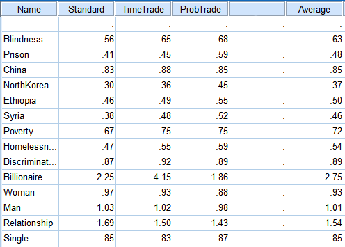 The numbers here are all means. The medians were mostly the same with the exception of the “billionaire” question, where a few people just seemed incredibly excited about the possibility of being a billionaire and everyone else was kind of meh (one friend noted wanting to be able to give the money to charity, which is something the question should have warned against). The median there was closer to 1.3 than the dizzying heights the mean attained. Another encouraging fact is that even with different floors, the people on Survey 1 and the people on Survey 2 came up with almost the same results once they were adjusted onto compatible scales:
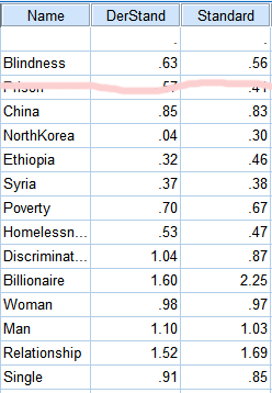 In the table above, DerStandard is derived from the second survey’s answers by trying to transform them to be on the same scale as the first survey. Standard is the unadjusted answers to the first survey. As you can see, even though they were working from different starting points they came up with some very similar answers (only the first test is shown on the table, but the other tests seemed broadly similar). Last point. I put “blindness” on there because many people in health research have studied the negative utility of blindness and I wanted to see if this test, amateurish and haphazard as it was, would get the same results they did (which might in turn legitimize some of its other numbers). The CHUM-T gets a utility weight for blindness of .63. Tufts’ database of utility weights lists numbers between .4 and .69 (also other numbers for various technical terms that mean blindness, but I think the exact wording is important here).
So I guess if I can conclude anything from this, it’s that utility measurement is very hard and produces confusing results, but that this test doesn’t seem to be any more wrong than others.
You can download the raw data in .csv format here. Tell me if you find anything cool.