Working With Google Trends
[Epistemic status: low. You tell me if you think this works.]
Commenter no_bear_so_low has been doing some great work with Google Trends recently – see for example his Internet searches increasingly favour the left over the right wing of politics or Googling habits suggest we are getting a lot more anxious.
I wanted to try some similar things, and in the process I learned that this is hard. Existing sites on how to use Google Trends for research don’t capture some of the things I learned, so I wanted to go over it here.
Suppose I want to measure the level of interest in “psychiatry” over the past few years:
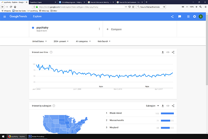 Looks like interest is going down. But what if I search for “psychiatrist” instead?
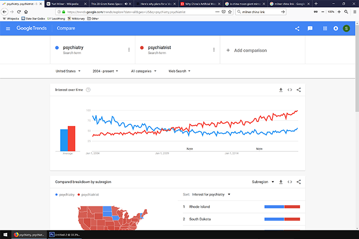 Uh oh, now it looks like interest is going up. I guess what I’m really interested in is mental health more generally, what if I put in “suicide”?
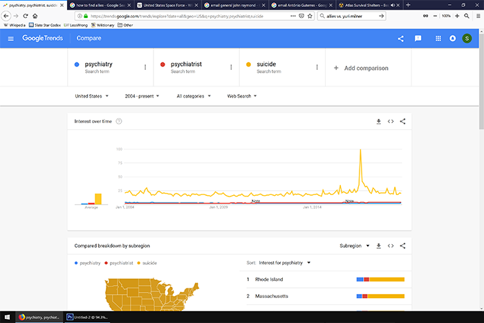 Now everything else is invisible, and the data are dominated by a spike in August 2016, which as far as I can tell is related to the release of the movie “Suicide Squad”.
I could try other terms, like “depression” and “anxiety”, but no_bear’s data already tells us those two are moving in opposite directions. Also, depression has a spike in late 2008, which must be related to the stock market crash and people’s expectations of an economic depression. This doesn’t seem like a great way to figure out anything.
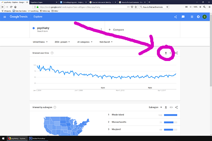
I wondered if averaging a bunch of things might take away some of the noise. I chose nine terms that seemed related to psychiatry in some way: psychiatry, psychiatrist, psychotherapy, mental illness, mental health, suicide, depression, antidepressants, and anxiety. Google won’t let you combine that many terms in a single query, but that’s okay – I don’t want to see them relative to one another, I just want to get standardized data on each. There’s a button to download any individual Google Trends query as a spreadsheet:
 Don’t do this with a comparison graph like the last one. Otherwise you’ll get everything standardized relative to each other, and you won’t be able to compare different sets of multiple queries. Do it for a single trend line, do it a bunch of times, and then manually copy-paste all of them onto the same spreadsheet.
When I average all nine of those search terms, I get the following plot:
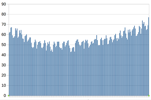 …which at least looks a lot simpler and more informative than most of the individual ones, and which doesn’t have any big spikes for movie releases or anything. It also doesn’t seem very sensitive to any small changes; when I take out the most dramatic outlier, anxiety (which has been increasing worringly fast; see no_bear_so_low’s article above for more), it changes to this:
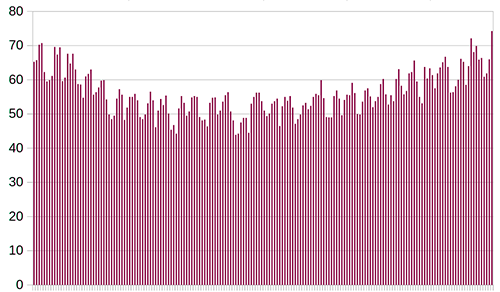 If you look really closely, you can see these are different graphs, but it sure isn’t a big difference.
These both have a kind of regular sawtooth pattern with a six month cycle; the peaks are always around April and October, and the valleys are always around July and December. These correspond nicely to school terms and vacations. While it’s possible that school is stressing people out and making them more worried about their mental health, you get these peaks in almost every field that anyone might study in school; I think it’s more likely that psychology students are looking these things up as part of their schoolwork.
Can we trust this? Can we do better than this? I imported these to SPSS and made a table of the correlations between each of the nine terms:
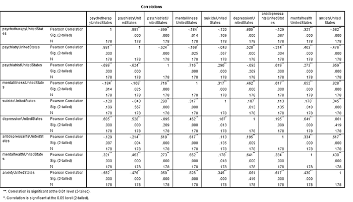 A lot of things are negatively correlated. I don’t trust the coefficients and significance numbers much – I think they’re just temporal autocorrelation – but it’s kind of disturbing to see so many things going the opposite direction. Then again, we already knew this from the first psychiatrist-vs-psychiatry graph. I don’t know what I expected to see here and maybe this was a stupid thing to even investigate.
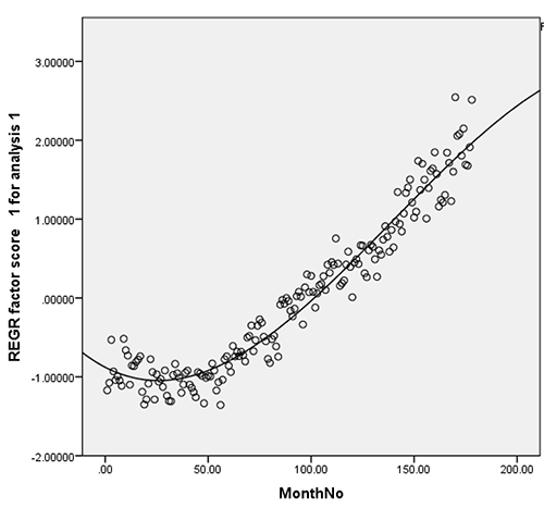
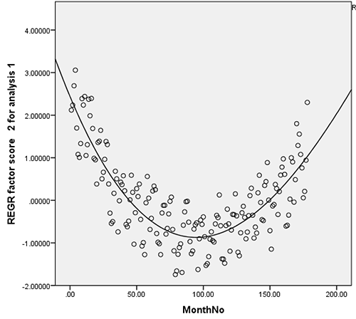
Maybe a factor analysis would be more illuminating. Here’s what I get:
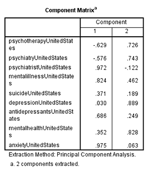 This is pretty weird, but here’s how I interpret it. One factor is students with an intellectual interest in mental health – maybe they’re studying it, maybe they want a job in it. They Google things like “psychiatry” to learn about what psychiatry is and whether it’s a good career path. This has been going down over the past decade – I’ll talk about why this might be towards the end.
Another factor is people with mental health problems. They Google things like “psychiatrist” to try to find psychiatrists in their area, or “antidepressants” because they want to know if antidepressants will work for them. This has been going up over the past decade as more people worry about mental health problems.
On the other hand, maybe we can’t do this, because of the temporal autocorrelation. Maybe this is just giving us a List Of Things That Are Going Up and another List Of Things That Are Going Down. I don’t know how to solve this problem.
But in favor of this interpretation, consider:
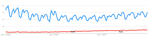 The blue line is “depression”, the red line is “depressed”. As predicted by the two-factor theory, “depression”, the very intellectual term that a student might type in to do their homework, is going down. “Depressed”, as in “help i am depressed”, is going up. “Depression” shows a strong school-related sawtooth pattern; “depressed” does not (it’s not just because of the different scales on this image; even a search for “depressed” on its own does not demonstrate the pattern).
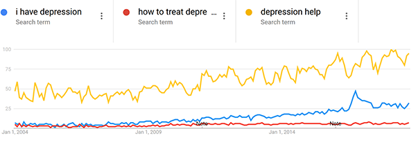
Also consistent with this theory, “how to treat depression”, “depression help”, and even “i have depression” are all going way up.
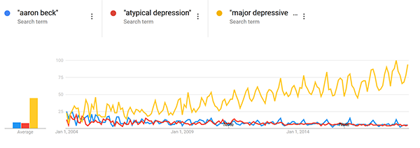
 Contrary to my theory – “major depressive disorder” (an overly formal way of referring to depression, mostly of interest to psychologists and psychiatrists) is going up. But “Aaron Beck” (a famous depression researchers whose work is often taught in school) and “atypical depression” (a subtype of depression mostly of interest to psychologists and psychiatrists) are going down.
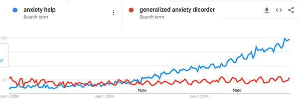
 And compare “anxiety help” vs. “generalized anxiety disorder”.
 Although it’s not perfect, I think this explains a lot of these seemingly contradictory results.
Here is a graph just showing just the factor which I think corresponds to something like “people with mental health issues”:
 And here’s one just showing just the factor which I think corresponds to something like “students with an intellectual interest in psychiatry”:
 I originally hoped this would explain no_bear_so_low’s main finding of anxiety (but not depression or other psychiatric conditions) increasing, on the grounds that “anxiety” searches are driven by anxious people, but “depression” searches (as opposed to “depressed” or “suicidal” or “sad”) searches are driven by students. This doesn’t work. There’s a slight trend in this direction, but not nearly enough to explain the disproportionate rise in anxiety.
Does the second factor indicate declining interest in psychiatry as a field? I originally thought it might not. 2004 was a long time ago. The 2004 internet, compared to the modern internet, was dominated by smart technophile early adapters and university students. So it could be that smart people remain interested in intellectual fields, but are gradually being diluted as a percent of the Internet’s user base. This could also explain the rise in Factor 1, if technologically-adept college-educated people have fewer psychiatric issues than other people.
I don’t have a really principled way to test this, so I just threw in a whole bunch of intellectual terms that I expected intellectual and college-educated people to search for and which I wouldn’t have expected to change much over the past decade. I tried to do five terms from five different fields of study, though due to computer error only three of the biology terms ended up included and I didn’t want to repeat the whole thing. Here’s what I got:
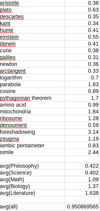 The number is (popularity over last twelve months)/(popularity over first twelve months), approximately (2018 popularity)/(2004 popularity). Although there are a few dramatic trends – fewer people interested in philosophers, more people interested in the Pythagorean Theorem – overall there is no sign of an intellectual decline.
Likewise, for non-intellectual subjects beloved of the unwashed masses:
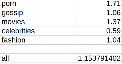 Again, a few things are going up, a few things are going down, but there is little sign of a general increase.
So here are my tips for researching things with Google Trends:
1. Individual keywords may be relevant for very some specific searches (eg “obama”), but can be dangerous when looking at broader trends. For example, “psychiatry” and “psychiatrist” have gone in opposite directions since 2004.
2. Averaging large numbers of related keywords might help with this problem, but can cause issues of its own.
3. Factor analysis might help with averaging large numbers of related keywords, especially in generating new theories and intuitions. I don’t know whether temporal autocorrelation makes it useless or dangerous.
4. If you see a sawtooth pattern with troughs during school vacations, this can help you figure out whether you’re looking at students or at “organic” results. The higher the peaks and troughs of the sawtooth, the more your data are skewed towards student searches.
5. Surprisingly, there doesn’t seem to be a clear need to adjust your data for a general intellectual decline in the Internet.